
Free Fonts / Q / Quite Good Regular - by Misti Hammers (1 fonts)
Quite Good Regular
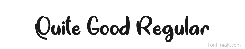






Quite Good Regular is a distinctive and charming display font designed by Misti Hammers, encapsulating a playful yet sophisticated aesthetic. This font falls under the category of handwritten typefaces, characterized by its casual elegance and inviting demeanor. The strokes are slightly irregular, giving it an organic feel that stands out in various design contexts. With a medium stroke weight and moderate contrast, Quite Good Regular strikes a balance between legibility and artistic flair. The spacing is well-considered, allowing for easy reading while maintaining a cohesive appearance.
This versatile font is perfect for a range of creative applications. It shines in wedding invitations, where its whimsical nature can evoke warmth and joy. It's also an excellent choice for restaurant menus, adding a touch of personality that complements any dining experience. Additionally, Quite Good Regular is suitable for movie posters, where the unique style can capture attention and convey a sense of creativity. Content creators will find it ideal for social media graphics, as its friendly vibe resonates well with audiences. Graphic designers will appreciate how this font can elevate branding projects, making them memorable and engaging.
Targeted towards graphic designers, small business owners, and content creators, Quite Good Regular offers an approachable and modern touch to any project. The font is available as a freeware, making it accessible for those looking to enhance their design toolkit without breaking the bank.
In summary, Quite Good Regular stands out due to its unique blend of whimsy and sophistication, making it a delightful choice for various design needs. With its appealing characteristics and broad usability, this font is a fantastic option for anyone seeking to add personality and flair to their work. Don't miss the chance to explore the Quite Good Regular font free download and elevate your next project.